Better user interface through DAX: Always show only 4 quarters in Power BI

No matter which quarter the report consumer selects, the report updates to show 4 quarters at a time. I highlighted 2022Q4 in pink to make it easy to demonstrate what’s happening.
Report consumers have a lot of choices when viewing reports in Power BI. With a typical report showing a slicer and four quarters, they could select 1 quarter, 3 quarters, or 20. They could select every other quarter or 4 at random. It’s hard to imagine the business cases for every one of these possibilities.
Simplicity is key to increasing usability.
I want to enable report consumers to explore the data without having to think about the process of exploration. With this solution, a consumer can move back in time one quarter in time or jump from the current quarter to to the same quarter last year while keeping as much the same as possible, making it easier to think about comparisons.
For my solution, I want to keep the DAX to a minimum. One DAX measure powers this interface, and this measure will work with whatever other measures added to the report.
Steps to build (each bullet has a jump link):
a date table with fiscal quarter in year quarter format, fiscal start and end dates, and an index of fiscal quarters over the years (Power Query);
a disconnected table based on the fiscal quarter information (Power Query);
a DAX measure to get the max fiscal period from a slicer and filter the dates to a four-quarter period. And a couple of other measures for quality of life (DAX);
a slicer and a column chart. Use visual filters and measure on an axis so that they work as smoothly as possible for the report consumer (Visuals).
How to decide between M, DAX, and visual format settings (bringing it all together).
Download the Show Only Four Quarters report file from my GitHub repo.
Get a date table
Many data warehouses have fiscal quarter with year, fiscal period start & end dates, and index of fiscal quarters over time, typically the number of quarters since the year the company began. If you have this already, then skip to the next section: Making a disconnected table for slicer.
I got a simple fiscal calendar from ChatGPT. I had to correct a few errors in the advanced query editor, so I don’t recommend using ChatGPT for creating M yet. I also tried Bing Chat, and the results were worse, but sometimes Bing Chat would throw up its hands and suggest a blog post instead. I expect that AI specifically trained for Power Query would be much better. If you’re curious, I left the original prompt and errors in the comments of the Dates table of my file. In general, I either use a data warehouse or copy paste a date table query from my files or from a blog.
With my original date query, I had Fiscal Year, Fiscal Month, and a Fiscal Name in the format of YYYYQ4. To get a fiscal start, end, and index, I used group by on the Transform ribbon.

Group By: Fiscal Quarter Name; Aggregate all rows and add Fiscal Quarter Start & End Dates and min/max aggregations of Date column.
Once grouped, I added an Index from 1 called Fiscal Quarter Sequence. Since the fields are already in ascending order, this causes the quarters to be numbered from the beginning to the end of the date table. I expanded all fields except the original Fiscal Quarter Name from the All column. The Fiscal Quarter Name is already there because it was the group by column. I also moved the Fiscal Quarter Name back to the end of the columns using the Transform ribbon.
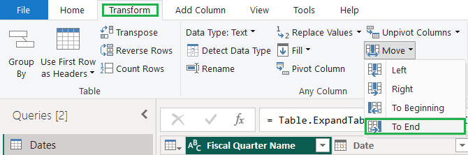
I LOVE this move column(s) button on the Transform menu, don’t you?
Make a disconnected table for quarters
Select Last Fiscal Quarter
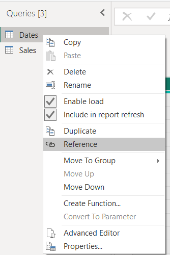
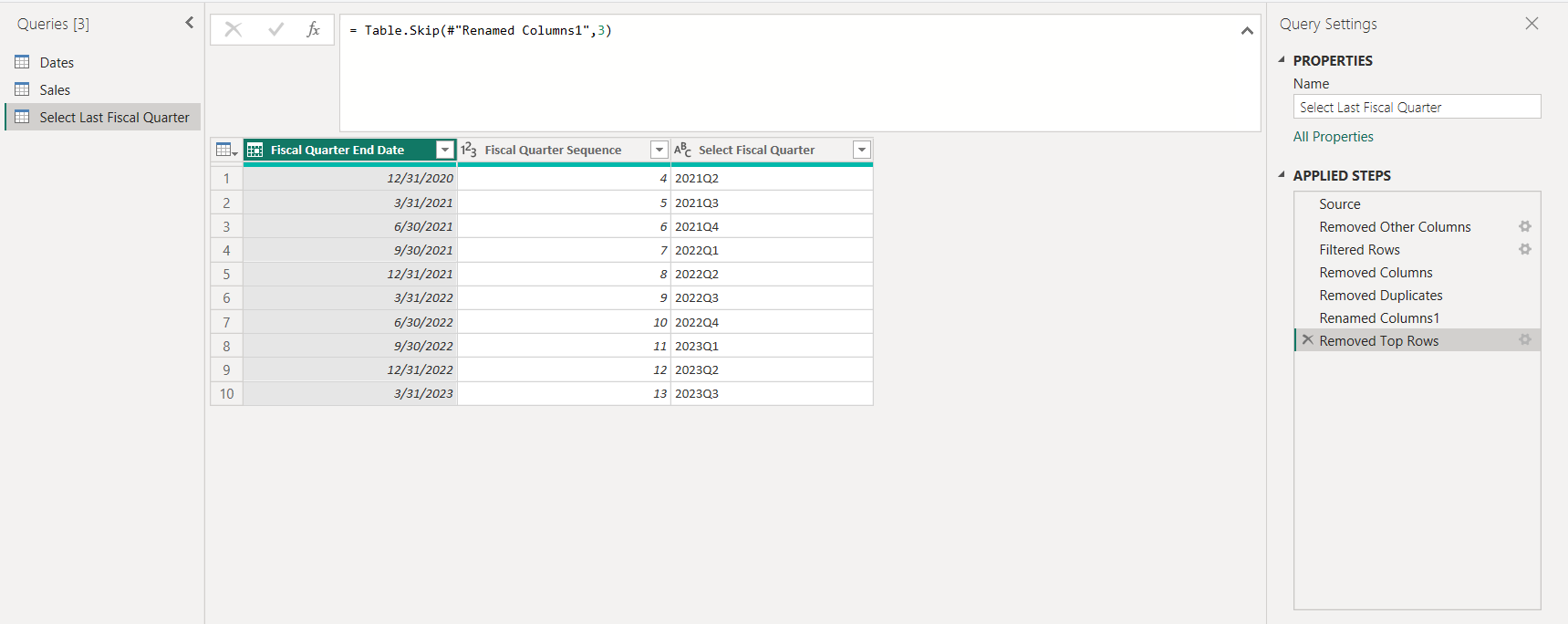
To create a new table, I reference my date table in the query editor to make a new table. The new table will change whenever the underlying query is changed. I rename it from Dates (2) to Select Last Fiscal Quarter.
In the new query, I selected columns of Date, Fiscal Quarter End Date, Fiscal Quarter Sequence, Fiscal Quarter Name. I filtered [Date] <= Date.From( DateTime.FixedLocalNow() and and [Date] >= List.Min(Sales[Date]), and then removed the date. This step removes future dates and trims the date range to the earliest sales. I removed duplicates from the Fiscal Quarter End Date to get one row only for each fiscal quarter. Lastly, I removed the top 3 rows. By removing these rows, I’ll prevent the case of a consumer clicking on the oldest rows and only seeing less than four columns in the chart.
Query for Select Last Fiscal Quarter
After closing and loading a disconnected table, check to be sure that there is no relationship between the new table and the date table. If there is a relationship, remove it so it doesn’t over-filter the date ranges.
Get the 4-quarter date range with a DAX measure
Selected Four Quarters =
    VAR _startDateShown = MIN(Dates[Date])
    VAR _endDateShown = MAX(Dates[Date])
    VAR _selectedQtr = MAX('Select Last Fiscal Quarter'[Fiscal Quarter Sequence])
    VAR _SelectedEndDate = MAX('Select Last Fiscal Quarter'[Fiscal Quarter End Date])
    VAR _SelectedStartDate = LOOKUPVALUE(Dates[Fiscal Quarter Start Date], Dates[Fiscal Quarter Sequence], _selectedQtr - 3)
RETURN
INT( _startDateShown >= _SelectedStartDate && _endDateShown <= _SelectedEndDate
The above measure returns 1 or a 0 to control if a quarter shows on my visual. _startDateShown and _endDateShown refer to the date table, which provides the axis for the chart.
Imagine if you will that the visual considers every possible Quarter Name in the Dates table for inclusion in the chart.
The formula after the RETURN evaluates to true or false. The INT function turns true or false into 1 or 0 so it can be used as a visual level filter on the column chart.
The _SelectedStartDate and _SelectedEndDate variables get the selection made in the slicer on the ‘Select Last Fiscal Quarter’[Select Last Fiscal Quarter] column. MAX gets the maximum filtered value from the slicer. I used max instead of SELECTEDVALUE because I really just want the max of this table. If a consumer clicks 8 checkboxes, 1, or none, it will always work the same way.
_SelectedEndDate is easy because it’s in the table already. A max here stores it in the variable. To get the _SelectedStartDate, I use the quarter index, subtract 3 and do a lookup on the Dates table to find the quarter start date for 3 quarters back. When the DAX engine evaluates this expression for every possible quarter on the axis, it will return a 1 if in range or 0 if out of range.
One more measure for quality of life:
Quarterly Sales Axis will scale the chart by the maximum Sales per quarter. MAXX iterates through the quarters and returns the value of the highest one. I multiply this value by 1.1 to give some headroom for the tallest one. This will be the formula for the axis in the chart visual.
Quarterly Sales Axis =
VAR _maxSales =
CALCULATE(
        MAXX(VALUES(Dates[Fiscal Quarter Sequence]), [Total Sales]
    ),
        REMOVEFILTERS( Dates[Fiscal Quarter Name])
)
RETURN
_maxSales *1.1
Visuals to bring it all together: slicer and column chart
Now that the queries are right and I have measures to support the design, I can setup the visuals. In this report, I have two visuals: a slicer and a column chart.
For the slicer, I want to format it so that it encourages single selection.

On-object formatting shows up when slicer is selected. More options button shows the filter pane.
Format the slicer. Setting a title helps with accessibility and with managing the objects on the report canvas. I turn off the slicer header so the slicer has only one layer of labeling. Under options, vertical list is the default, and I have multi-select with CTRL on. This option acts similarly to single-select. Clicking from item to item clears the previous item unless the report consumer holds down CTRL while clicking. Unlike single-select, this option allows the slicer to have no value selected. With no value selected, the chart will show the most recent four quarters.
Format the column chart.
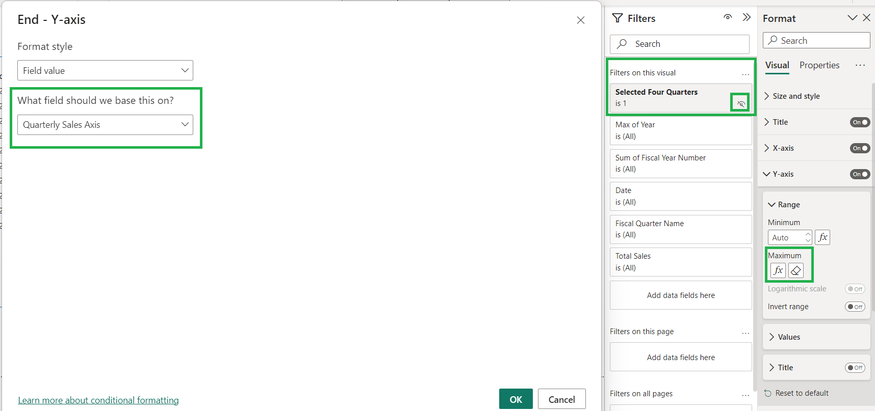
In the format pane, I add Quarterly Sales Axis measure to the Y-axis maximum. Instead of resizing dynamically, the chart axis will stay the same no matter what the report consumer selects. This enables them to quickly compare values with a glance. I add Selected Four Quarters measure to the filters on this visual section of the filter pane. This ensures that the chart will always show only four quarters. To clean up the chart, I turned off titles for the x- and y-axis. I turned on data labels outside the end because it makes figuring out the amounts simple. I set units for values to millions. For this demo, I also chose a different color for 2022Q4.
M, DAX, or visual format setting?
This post is one example of combining queries, DAX, and visual options to create a streamlined user experience for report consumers. This solution uses Power Query to shape the disconnected table used for the slicer. While I could have achieved similar results with DAX, doing it in Power Query makes for simpler DAX that will be easier to maintain. Thanks to the great formatting options, in Power BI Desktop, I only needed a couple of DAX measures to get my desired results. The Selected Four Quarters measure works by filtering the axis, which means that I didn’t have to write complex DAX for Total Sales. It also means that this measure will work for other measures that could be added later, like Cost of Goods Sold (COGS), Margin, ratios, or other formulas.
With the richness of visual format options, DAX, and M, it can be challenging to decide which tool to use for a particular result. I try to keep things as simple as possible, which means using each tool for what it’s most suited to.
I start with visual format options because that’s usually simplest. These options are built into Power BI Desktop and well documented by Microsoft. I tend to avoid bookmarks because their infrastructure can be complex to document and maintain, especially when report owners change.
To get specific results, I typically turn to DAX. The CALCULATE function, date intelligence, and other functions make DAX very powerful. However, when formulas start getting complicated, I think about how queries could enable me to write simpler DAX.
Using Power Query to get a simple star schema model connected with unidirectional filtering relationships is foundational to writing simple DAX. Power Query can be invaluable in adding date columns to support simple calculations.
When I built this solution, I started with a disconnected table which had only the Fiscal Quarter Name. I could have done lookups on the date table to get the other attributes related to Fiscal Quarter Name. However, it was pretty simple to modify the query to keep the Fiscal Quarter End Date and the Fiscal Quarter Sequence columns, so that I could reference them in my measure. On the other hand, it would have been more complex to add a Fiscal Quarter Start Date column for 3 quarters back into the query, so I used a DAX lookup instead.
In a similar way, I considered using a measure to filter the Select Last Fiscal Quarter slicer. This kind of visual level filter is commonly used to get slicers to sync with each other and with the fact table (SQLBI). Because this slicer uses a disconnected table, the DAX to make it work got complicated (using the TREATAS function). It was also slow— even with a small dataset. So, I trimmed the Select Last Fiscal Quarter to match the Sales table. I added the Date column back to the start of the query to use for comparison. I filtered out future dates, and I used the min of the sales date in the sales table to find the earliest date. Then I removed the Date column from the slicer table to clean up.
Another option would have been to trim the Dates table itself to match the range in the Sales table, but I wanted a solution that would work even without a trimmed Dates table. There are good reasons to have a non-trimmed date table: for example, a non-refreshed import date table used with DirectQuery fact table.
Use the right tool for the job. Know enough about visual filter options, DAX, and Power Query to make reports which are simple to maintain over time. Power Query can do amazing things with columns. DAX filters rows quickly and powerfully. And the visual format options have been improving so rapidly that they may render this solution obsolete.
Conclusion
What other design choices could report creators use when making reports? The principles of clean dashboard design and data storytelling are a starting point. But how else can we increase usability through simplicity? What other ways are there to empower report consumers to explore the data without making things more difficult for them?