Troubleshooting Problems with Power BI Table Visuals
Power BI table visuals are powerful and approachable. You can easily start using table visuals without having to know how they work under the hood. When you run into a problem, that’s when knowing about the mechanics becomes helpful.
Distinct coordinates
As with other visuals, table visuals are made up of values & coordinates. A table could be all values, all coordinates, or some mix of both— in any order desired. Values are aggregations, like sum, max, min, average, first, or last. I’ve said before that “Coordinates are not aggregations, but columns from the data model.” Strictly speaking, however, coordinates are the distinct points from the column. That is, if the category “Bikes” appears in your table 10,000 times, it’s only shown once. When you have multiple coordinates on a table, you’ll have rows to represent the unique combination of coordinates. Power BI trims the starting text of columns, so that “Bikes” is equal to “ Bikes” (underlined so you can see the leading spaces). It also ignores capitalization, so “1500a” is the same as “1500A.” This is by design, so don’t hold your breath waiting for a fix.
Auto-exist
Coordinates from the same table are brought in using auto-exist, which is Power BI’s handy way of getting just the combinations that exist between columns in a table. Coordinates in different tables are cross joined, so every possible combination is generated. Power BI then keeps only the rows which intersect: basically there’s a value in the transaction table which brings together the two dimensions. If you need all of the combinations, turn on ‘Show all values’ in the field list. Alberto Ferrari has a great article on auto-exist, and the problems it can cause when using a flat table as a data model with slicers from the same table.
Problem 1: Missing ‘unique’ coordinates
Let’s say you have a data table where every Part # is expected to appear once, but for some reason there’s a duplicate Part #.

Query editor on left shows 3 rows where CreatedDate is 2016-05-29 and Code is 335. On right, table visual shows one row for these 3 data points in the table. From a post in Power BI Community forum.
Putting the field on a table visual will treat those two values as the same and summarize them as one row. Even if you have that column set as “Don’t summarize” in the field well, it will still only show distinct combinations of the columns on the visual. A problem like this is best figured out in ETL: Power Query or SQL.
FIX: To figure it out in a Power BI table visual, you need to add an index to the table before loading it into Power BI— and then, put that index on the table visual. The Power BI documentation on table visuals says that: “Tables are a great choice: To see and compare detailed data and exact values.” Well, they’re a great choice to see exact distinct values.
Problem 2: Oops, my ID got summed/counted
When you put columns on a visual, you may notice that there is a total row that you didn’t expect. Or, the rows don’t match the data. This is caused by default summarization of field. That is, Power BI has guessed that some fields should default to values rather than coordinates.
To begin with, here’s the data we’re working with:

Eight rows of data in the Power Query editor. Date is text. ID & Index are whole number.
And the visual:
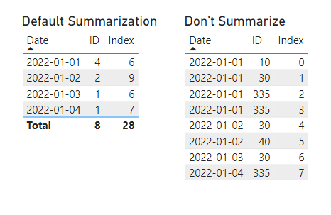
Two table visuals.
On the left, default summarization where ID adds up to 8 and Index adds up to 28 in the Total. Table on the right, Don’t summarize, has 8 rows like the data source. Curiously, ID is set to summarize by count and ID by sum.
FIX 1: from the field well, set to Don’t summarize

Click on the dropdown of a field to set to Don’t summarize.
FIX 2: set the default summarization for the column to none

Column tools show up in the ribbon when a field is selected in the Fields pane of the report.
By selecting a column in the fields pane, you can set the Summarization from Count to Don’t Summarize. It’s a best practice to do this for numeric IDs and other fields used as categories rather than values.
Problem 3: So your detailed table visual is slow…
Tables can only hold so many columns before they get slow or stop working. You might think that replacing redundant coordinates into measures might help (for example, a name column when employee id is already on the table), but in Power BI, replacing columns with measures on a table visual makes performance much worse. If I had to guess, I’d say that Power BI is already optimizing the display in a discreet way.
As much as I’d like to offer an easy solution to this performance issue, the reality is that there isn’t a quick fix. Use the filter pane to reduce the amount of data shown. Or, make the detailed visual a drill-through page for a set of filters that do the same thing. The size and the complexity of the model also has an impact on how many columns can be displayed.
Possible FIX: add a value from a fact table
If your model is complex and you’re showing data from tables that aren’t directly related, try adding a field from a fact table to the visual. It may improve performance of the visual. Why does this work? My guess is that it gives Power BI a shortcut in the whole cross-join and keep only what’s needed process. By giving Power BI an explicit data point in the fact table, it only has to get the actual combinations of data from the other tables.
Problem 4: No data to show
Looking at your data, you notice that something is missing. For example, you have 10 salespeople but no sales for 2 of them, so you only show 8 rows instead of 10. Since the table only shows the intersection of the coordinates, the rows for salespeople without sales are removed.
FIX: Show items with no data.
In the visualization pane, in the field wells, right click a field or click the dropdown menu and select ‘Show items with no data.’

This enables the full cross-join of each table to be shown. If you have a salesperson table and a product table on your visual, it will show every combination of product and salesperson— which might or might not be what you need. In that case, you may be better off using a matrix visual where the gaps look better.
These are some basics of how tables work. For more info about table visuals, see Microsoft Power BI documentation on table visuals.