How Do Power BI Visuals Work? Values & Coordinates
Today, I’m going back to the beginning. I got my start with DAX via Rob Collie, the the P3 Adaptive Blog, and the 2nd Edition of Power Pivot and Power BI: The Excel User’s Guide to DAX, Power Query, Power BI & Power Pivot in Excel 2010-2016. The book is still one of the best guides for learning to think in DAX, and its key points are available as a free download: “Steal” this Reference Card! How the DAX Engine Calculates Measures. While this is where I’m coming from, you don’t need it to follow this post.
Let’s Create Our First Visual
When Rob teaches DAX, he starts by putting a value on a pivot table. This is a great practice to follow. The results show up fast and it keeps the focus on the amounts which change according to filtering and time.
A value is an aggregation, usually of an amount: sales in currency, counts, ratios. DAX measures are values. If you drag a column onto a visual, it may create an implicit measure. You can also create implicit measures by using the dropdown in the field list for a visual and selecting sum, count, first, last. Values on visuals never impact the evaluation of measures, or other values.
If you drag a column to a visual, it might display as a value or a coordinate, so I’m going to start by creating a measure and putting that on my visuals. I right click on the Sales table in the field list and select New Measure. In the formula bar, I type: Total Sales = SUM('Sales'[Sales Amount]). I click the visual icon in the Visualizations pane, and then check the [Total Sales] measure in the field list to create the visual.
Start with a Value
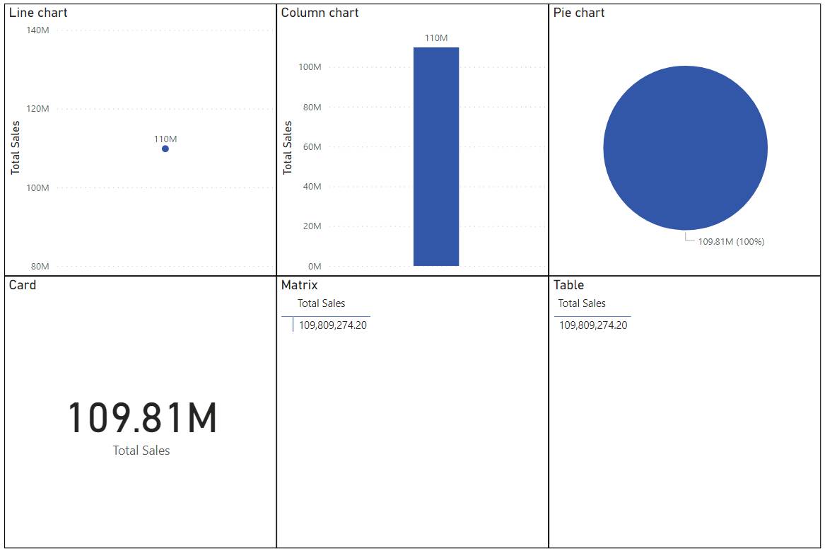
Create a visual by starting with a value. A value is an aggregation.
I created six visuals to show how values appear on each one. For a line chart, there’s a single dot at 110M. The column chart has a column with 110M. Pie chart is one color at 109.81M. Card shows 109.81M only. Card visual is special, because it can only show a value.
Matrix & Table visuals are special.
Matrix shows a blue T to create separate areas. Above the T is the name of the value: the Sales Amount value. The left side of the T is blank, and the value of $109,809,274.20 is shown on the right side.
Table shows the value 109,809,274.20, but there is no indicator as to whether it’s a value or not.
Add a Coordinate
Now, I’ll add a coordinate to each visual. Coordinates are not aggregations, but columns from the data model. Coordinates provide the context for evaluating a measure.
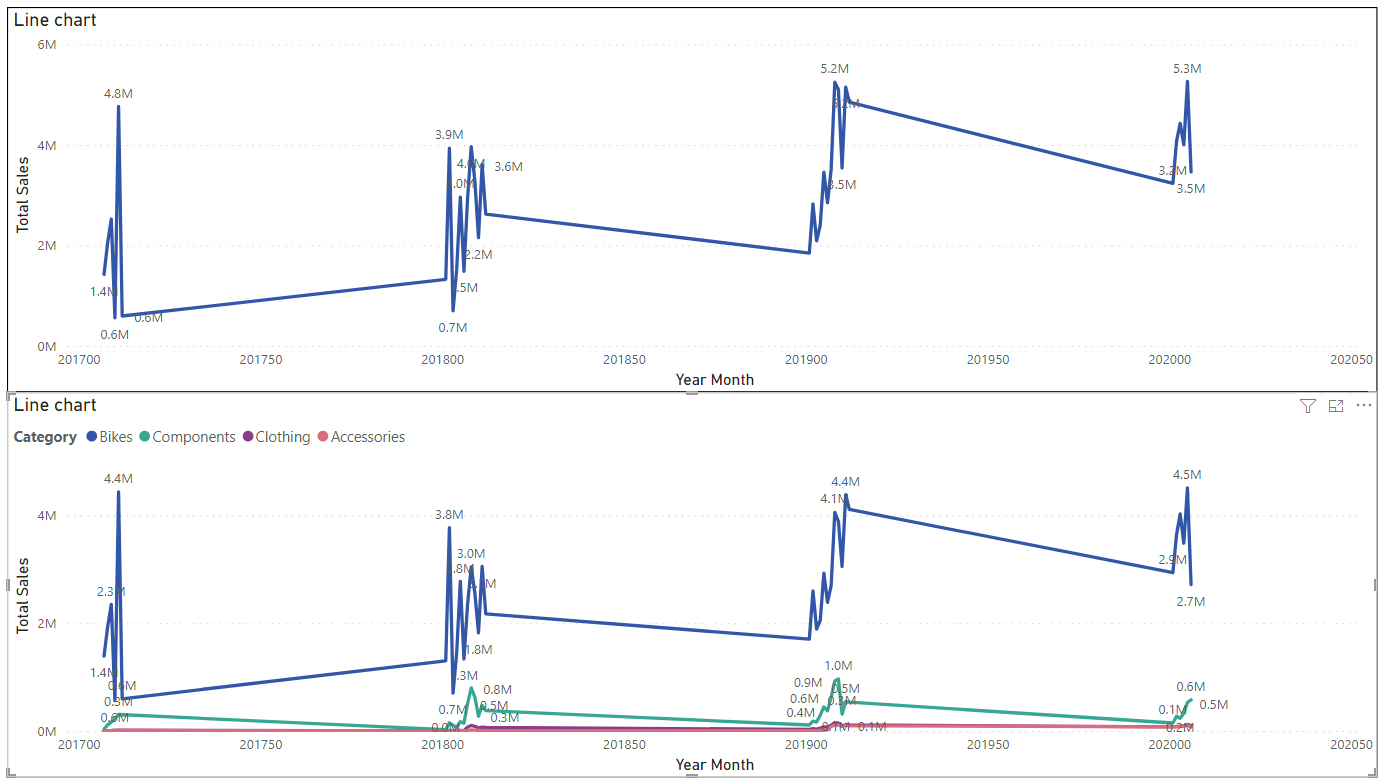
Line charts: above, Total Sales is shown as a line across months from 201700 to 202000. The axis is continuous, so the numbers shown (e.g. 201900, 201950) look a bit strange. This can be fixed by selecting categorical axis and sorting by Year Month. The chart below shows four lines: Bikes, Components, Clothing, Accessories.
For the line chart, I added Year Month column to the x-axis. The top visual now shows Total Sales according to Year Month. In the second line chart, I added the Category column from the Product table to the Legend area of the field wells in the visualizations pane. Both Year Month and Category are coordinates on this visual, displaying the value of the [Total Sales] measure according to the intersection of those coordinates.
Good to know: Line charts allow a secondary value as well, so you could look at a measure for units sold on the same chart with Total Sales. The Small Visuals section is another area where the values could be shown by coordinates. Putting Categories in Small multiples, would generate a separate line chart for each category.
Column charts, bar charts, pie charts are all similar to line charts. You can show bars, columns, or pies by Category or another attribute.
Slicers are special because they ONLY show coordinates and can’t show values.
Values & Coordinates Summarized
I think of values as dynamic and coordinates as static. If values are amounts & counts, then coordinates are the categories, attributes, and time units which break up that value for comparison. In a Power BI data model, values usually come from transaction tables aka fact tables, while coordinates usually come from lookup tables aka dimensions.
These visuals have areas for values & coordinates. Most visuals need both values & coordinates to be useful.
Bar charts & column charts
Line charts
Pie charts & Donuts
Tree maps
Cards only display values.
Slicers only display coordinates.
Scatter charts are cool because they display 2 values combined into a cartesian coordinate for each visual coordinate. With bubble sizing, you can even show a third value.
Tables Are Weird— powerful, but weird
The other visuals have reserved sections for values and coordinates, but tables do not. A person can blithely drag columns or measures to a table visual without thinking about whether it’s a value or a coordinate. A table could be all coordinates, it could be all values, or some mix of both. As with a matrix visual, you can have coordinates on the left and values on the right. Unlike a matrix visual, however, you can have values on the left side of coordinates— or sprinkled willy-nilly among the coordinates. This is super powerful compared to Excel pivot tables, and was one of the killer features of Power BI when it was first released.
Why does it matter?
Coordinates impact how values are calculated on visuals. Values on visuals do not impact how values are calculated. This means that when you write measures, you can let the coordinates do the work. You don’t need to write a formula for each month or or each category, but write one formula which works on multiple visuals across various categories.